Shelves for KPI Visuals
A KPI visual has the following shelves:
- Dimensions
-
Add a Dimension field from the Data menu to display a specific dimension value.
This shelf accepts multiple fields, but the visual displays only the first dimension or measure. Here are some additional notes about the shelf:
- If something is placed here while the Measure shelf is blank, then the visual displays the first value in the dimension as the main indicator.
- If you order this shelf, then it displays the first value based on the order parameters.
- If you want to display a dimension sorted by another dimension, place a second dimension on the shelf and sort by it. The visual displays only the first dimension value on the dimension shelf, but the sorted specification on the second dimension determines the order.
- To display a measure value sorted by a dimension (or a dimension sorted by a measure), place the fields on the matching shelves, and sort according to your business case.
- Measure
-
Add a Measure field from the Data menu to display an aggregate.
This shelf accepts a single field.
The measure shelf either provides the main indicator, or it can be used for sorting. If a measure is used, the display format on this shelf dictates the appearance of the main indicator.
- Compare To
-
Add a Measure field from the Data menu to show a comparison aggregate as a target value.
This shelf accepts a single field.
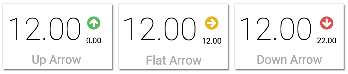
If Dimensions/Measure and Compare To shelves hold numeric values, this shelf specifies both the small value to the right side of the main measure (default placement), and an arrow.
Some notes on the arrow:
- If the primary measure indicator is higher than the Compare To value, the arrow will point up, and have the color specified for the up arrow in the Color settings of the visual.
- If the compare value is higher, than the arrow points down, in the color specified for the down arrow in the Color settings of the visual.
- If the two values are identical, the arrow is 'flat': it is horizontal, and points to the right.
It is possible to switch the comparison direction by Flipping the Comparison setting.
- Label
-
Add one field to this optional shelf to provide a label under the main indicator (default placement). You can Change Label Position.
This shelf accepts 0 or 1 fields.
- Tooltips
-
Add Measure fields from the Data menu for additional information in the graph's Tooltip.
This shelf accepts multiple fields.
- X Trellis
-
Use fields from the Data menu to trellis the visual into columns.
This shelf accepts multiple fields.
- Y Trellis
-
Use fields from the Data menu to trellis the visual into rows.
This shelf accepts multiple fields.
- Filters
-
Add Dimension or Measure fields from the Data menu to include or exclude categorical or value criteria.
This shelf accepts multiple fields.