Box Plot Visuals
A box plot displays the distribution of data values. The box represents the bulk of the data (25th percentile through 75th percentile), and whisker lines represent statistical minimum and maximum values.
This example uses the 2012 and 2013 API Scores for California Schools.
We are working with the dataset School Performance, built on the ca-school-apis.csv datafile that contains the California School APIs from 2012 and 2013. Note that the range of possible scores varies from a low of 200 to a high of 1000. The statewide API performance target for all schools is 800. For an overview of shelves that specify this visual, see Shelves for Box Plot Visuals.
- Start a new visual based on dataset
NYC Taxi Data; see Creating Visuals. -
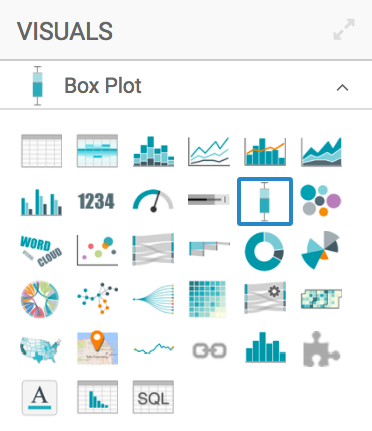
In the visuals menu, find and click Box Plot.
-
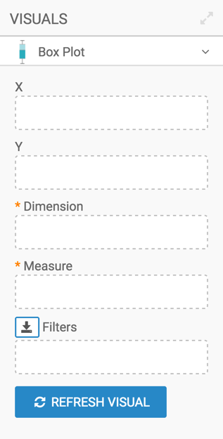
Note that the shelves of the visual changed. They are now X, Y, Dimension, Measure, and Filters.
The mandatory shelves are:
- Dimension: specify one dimension for grouping the box plot
- Measure: specify the measurement for box plot calculations
-
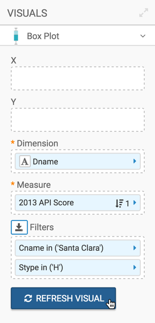
Populate the shelves:
- Place the field
Dname(district name) on the Dimensions shelf. - Place the field
Api13(API obtained in 2013) on the Measure shelf. - Add the field
Cname(county name) to the Filters shelf, and select a single value. We used Santa Clara. - Add the field
Stype(school type) to the Filters shelf, and select the value H, for Highschool.
- Place the field
- [Optional] Alias the shelves.
-
Click Refresh Visual.
-
The new box plot visual appears.
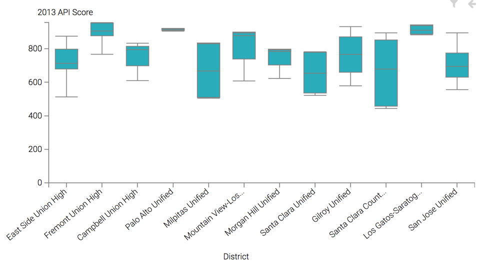
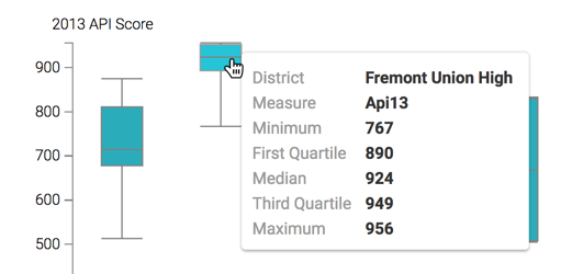
Note that hovering over a particular box plot distribution rectangle provides generates a Tooltip modal that contains the statistical measures of that grouping, including the minimum, the the first quartile, the median/second quartile, the third quartile, and the maximum.
-
Change the title to
High School Performance - Box Plot.-
Click (pencil icon) next to the title of the visualization to edit it, and enter the new name.
[Optional] Click (pencil icon) under the title of the visualization to add a brief description of the visual.
-
At the top left corner of the Visual Designer, click Save.
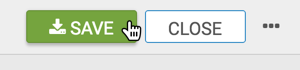
At the top left corner of the Visual Designer, click Close.
If you wish to generate a horizontal box plot visual, see the instructions in the article Making Box Plots Horizontal.
To adjust the box plot display, check all the available settings for this visual.