Correlation Flow Visuals
Correlation Flow visuals enable quick visual analysis of co-occurrence of two or more distinct dimensions. In simple form, a correlation flow chart is a linear representations of a 2-dimensional correlation heatmap matrix. Where a correlation heatmap represents correlation values through color intensity, the correlation flow plots thicker lines and taller dimension boxes to represent greater correlation. Note correlation flow is not limited to two dimensions; instead, you can model a large number of correlation 'dimensions'. Note also that ordering of the dimensions on the shelves of the visual provides different insights into the dataset.
The following steps demonstrate how to create a new correlation flow visual on a dataset Customer Value Analysis. This dataset is based on data previously imported into Arcadia from the datafile customer-value-analysis.csv. For an overview of shelves that specify this visual, see Shelves for Correlation Flow Visuals.
- Start a new visual based on dataset Customer Value Analysis; see Creating Visuals.
-
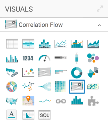
In the visuals menu, find and click Correlation Flow .
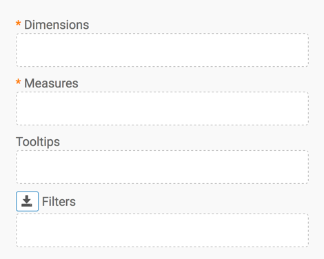
Note that the shelves of the visual changed.
They are now Dimensions, Measures, Tooltips, and Filters.
Both Dimensions and Measures are mandatory.
-
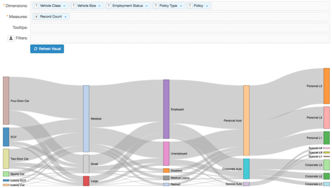
Populate the shelves from the available fields:
- Under Dimensions, select
Vehicle Classand drag it over the Dimension shelf on the main part of the screen. Drop to add it to the shelf. - Repeat for
Vehicle Size,Employment Status,Policy Type, andPolicy. - Under Measures, select
Record Countand place it on the Measures shelf.
- Under Dimensions, select
-
Click Refresh Visual.
The correlation flow visual appears.
Correlation Flow Visual -
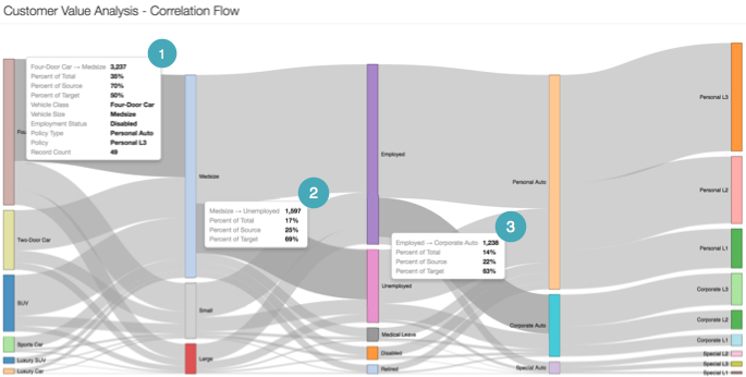
Note that each distinct line segment between two dimensional events reports its own correlation data, as demonstrated by the Tooltips in the following chart.
- Tooltip 1 demonstrates the correlation between Four-Door and Medsize vehicles. The dataset has 3,237 Four-Door cars, and they represent 36% of the total. Additionally, 70% of these cars are considered Medsize. Viewing this from the other direction of the correlation relationship, 50% of all Medsize cars are four-door cars.
- Tooltip 2 demonstrates the correlation between Medsize vehicles and Unemployed owners. It shows that 1,597 people are in both categories, and this segment represents 17% of all records. 25% of Medsize cars are owned by people who are unemployed, while 69% of unemployed people own a medsize vehicle.
- Tooltip 3 demonstrates the correlation between Employed owners and the ones who have a Corporate Auto vehicle policy. It shows that 1,238 people are in these two categories, which is 14% of the total. 22% of employed owners have a corporate auto policy, while 63% of people with a corporate auto policy are actively employed.
Correlation Flow Visual -
Click (pencil icon) next to the title of the visualization to edit it, and enter the new name.
- Change the title to
Customer Value Analysis - Correlation Flow. At the top left corner of the Visual Designer, click Save.