Funnel Visual
Funnel visuals enable us to explore user behavior across a sequence of discrete time-stamped events, specifically how sessions drop off; they are a very good way to measure conversion, or lack of them.
Funnels are an implementation of a Sankey plot: blocks represent individual events, and the width of the connection is proportional to the size of the measurement that connects any two events.
Funnel visuals are built by defining a path through time-stamped events. To define events for the dataset, see Events.
For contrast, see Flow Visuals.
- Funnel visuals are available in Arcadia Enterprise, not in Arcadia Instant.
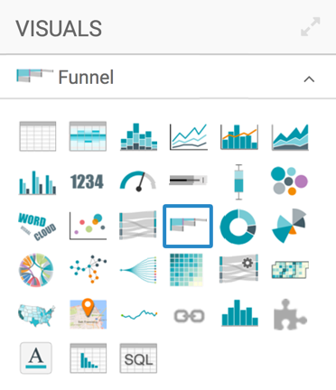
Basic Funnel Visual
The following steps demonstrate how to create a new funnel visual on a dataset Campaign. This dataset is based on data previously imported into Arcadia from the datafile campaign.csv. For an overview of shelves that specify this visual, see Shelves for Funnel Visuals.
- Start a new visual based on dataset Campaign; see Creating Visuals.
-
In the visuals menu, find and click Funnel.
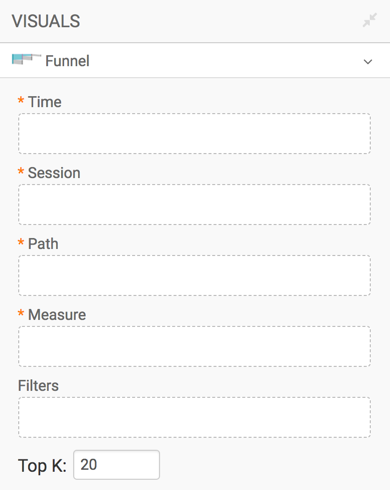
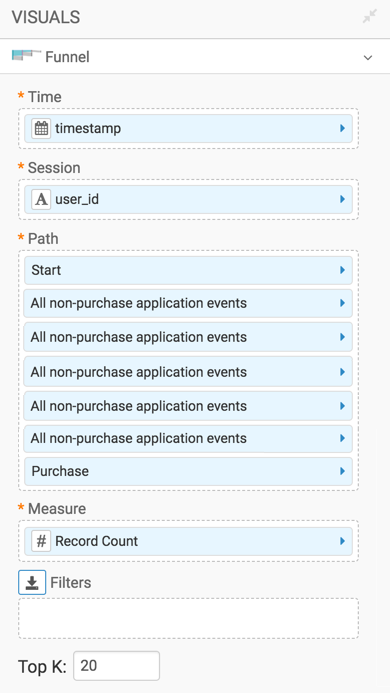
- Note that the shelves of the visual changed. These are:
- Time sorts events by the value of the timestamp.
- Session uses the unique identifier, such as user ID, to track the events of a session.
- Path specifies the series and order of the events; in this article, we use events that were previously defined in Events of the Campaign Dataset.
- Measure aggregates the measure that controls for the thickness of the 'flow' connections, such as Record Count.
- Filters selects for particular conditions.
- Top K selects the top N number of entries.
All shelves, except Filters and Top K, are mandatory.
-
Populate the shelves from the available Fields:
- Under Dimensions, select
timestampand place it on the Time shelf. - Under Dimensions, select
user_idand place it on the Session shelf. - Under Events, select Start and place it on the Path shelf. Similarly, add All non-purchase application events and Purchase, in that order.
- Under Measurements, select
Record Countand place it on the Measure shelf. - Leave Filters and Top K empty.
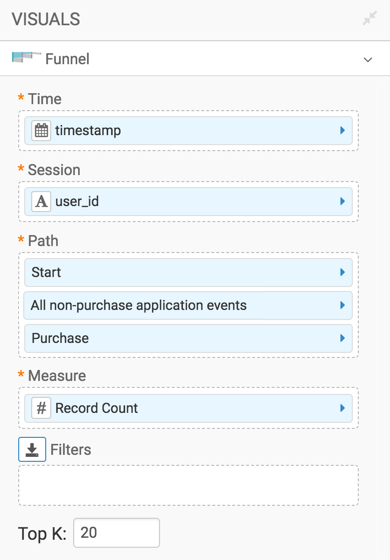
- Under Dimensions, select
-
Click Refresh Visual.
-
The funnel visual appears.
Note the highlighted path towards a purchase event, and the drop-off percentages on each segment: 39% for the first segment, and 60% for the second segment.
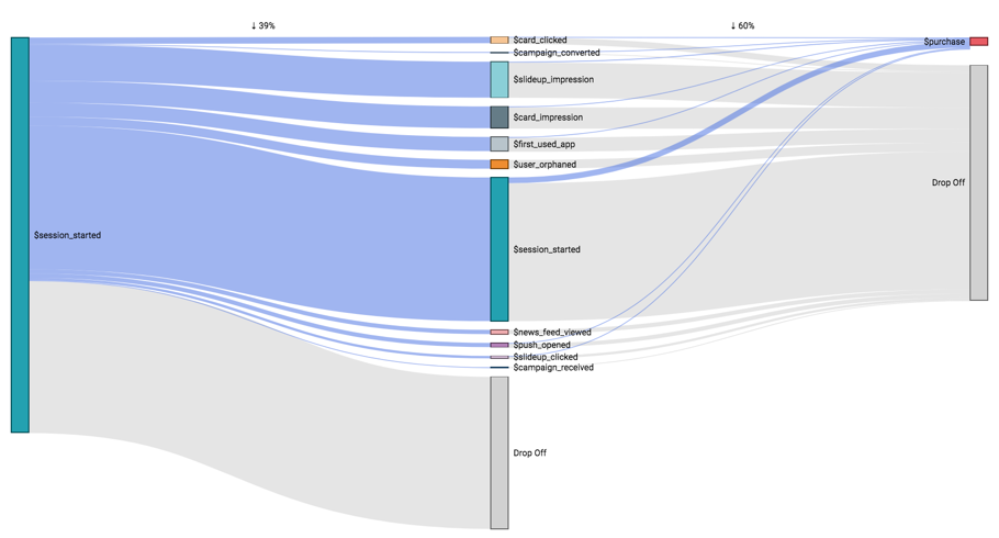
Funnel Visual -
Click (pencil icon) next to the title of the visualization to edit it, and enter the new name.
- Change the title to
Campaign - Funnel. At the top left corner of the Visual Designer, click Save.
Comprehensive Workflow Model
In the preceding funnel visual, each connection has at most two segments. This does not model the real business scenario.-
On the Path shelf, add an additional instance of the
All
              non-purchase application events
field, from the Events menu.Repeat until you have a total of 5 instances of that event type on the Path shelf. Remember that Purchase should be the last event on the shelf.
- Click Refresh Visual.
-
The funnel visual appears, showing a multi-step path towards a
Purchaseoutcome.Note that you can see both the purchase outcome path (highlighted) and the drop-off: 43%, 30%, 11%, 4.8%, 2.7%, and 8.6%.
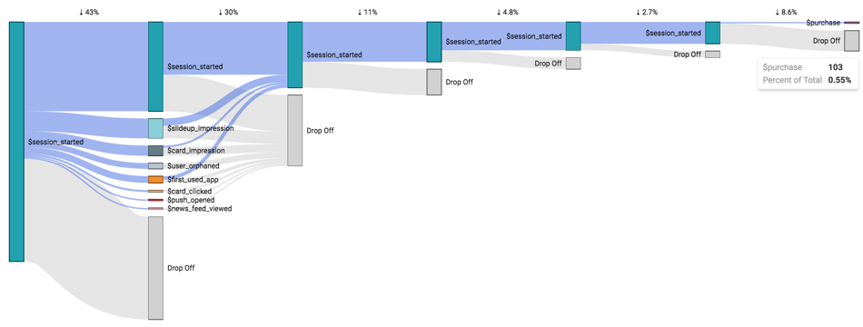
Funnel Visual with 5 Intermediate Steps