US County Map with Bubbles
Arcadia Data lets you plot measurements, as bubbles, over US County regions. Bubble maps display up to two measurements simultaneously: as the color of the bubble, and as the relative size of the bubble.
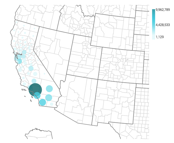
A county map of the United States shows a comparison of measurement values across US States.
The following steps extend the work completed in State Map with Bubbles and demonstrate how to create a map visual on the dataset US County Populations [data source samples.us_counties]. This produces a map with bubble marks that correspond to the total population of each county.
- Clone the visual that we developed in the article Country Map, Choropleth; see Cloning Visuals.
-
Under Dimensions, select
ctynameand add it to the Geo shelf.Click on the field to open the Field Properties menu, expand the Change Type option, and select the Geo Type County.
Alias the field
ctynameasCounty; see Alias. -
If the Size shelf is empty, add a measure to it.
Here, we plan to show the relative size of the Hispanic population across the country, so we are using the following expression in the Enter/Edit Expression editor:
sum([h_female]+[h_male]) - [Optional] Alias all the fields; see Alias.
- [Optional] Change the color palette or simply reverse it, as described in Change Color Palette and Reverse Color Palette.
-
Click Refresh Visual.
The map visual appears. Note that if you have Zoom enabled, the map automatically zooms in to show detail of California. See Customizing Zoom.
-
Click (pencil icon) next to the title of the visualization to edit it, and enter the new name.
- Change the title to
US County Population - Bubbles. At the top left corner of the Visual Designer, click Save.