US Zipcode Map with Bubbles
In Arcadia Data, you can plot measurements based on zipcode data. Bubble maps display up to two measurements simultaneously: as the color of the bubble, and as the relative size of the bubble.
A zip code map of the United States shows a comparison of measurement values across US States. Zipcode maps only work with bubble options.
We are working with the dataset Income Tax Returns, built on the tax_returns.csv datafile that contains statistical information about
Personal Income Tax Returns for 2016 (zip_tax_returns_2016.csv), summarized
by zipcode. See tax_returns_guide.doc for information about the dataset. To learn
how to add the data to your connection and build a dataset, see
Start a new visual based on dataset Income Tax Returns.
See Adding Data, Creating Datasets, and Creating Visuals.
-
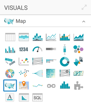
In the visuals menu, find and click Map (row 5, column 1).
-
Note that the shelves of the visual changed. They are now Geo, Color, Size, Drill, Tooltips, X Trellis, Y Trellis, and Filters.
The only mandatory shelf for map visuals is Geo.
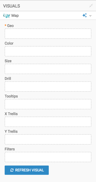
Populate the shelves from the available fields (Dimensions, Measures, and so on) in the Data menu.
Select
Zipcodeand add it to the Geo shelf. Notice that the field is automatically accepted as a Geo Type.Apply the display format for integers, removing the 1000s separator. See Integer Display Format.
In the Data menu, enter the term "schf" in the Search box, and then add the field to the Size shelf. Alias the field as Farm Returns.
-
Select
Stateand add it to the Filters shelf. When the Filter for State window modal appears, select the South Atlantic region states under the Values tab: DC (District of Columbia), DE (Delaware), FL (Florida), GA (Georgia), MD (Maryland), NC (North Carolina), SC (South Carolina), VA (Virginia), and WV (West Virginia). Click Apply.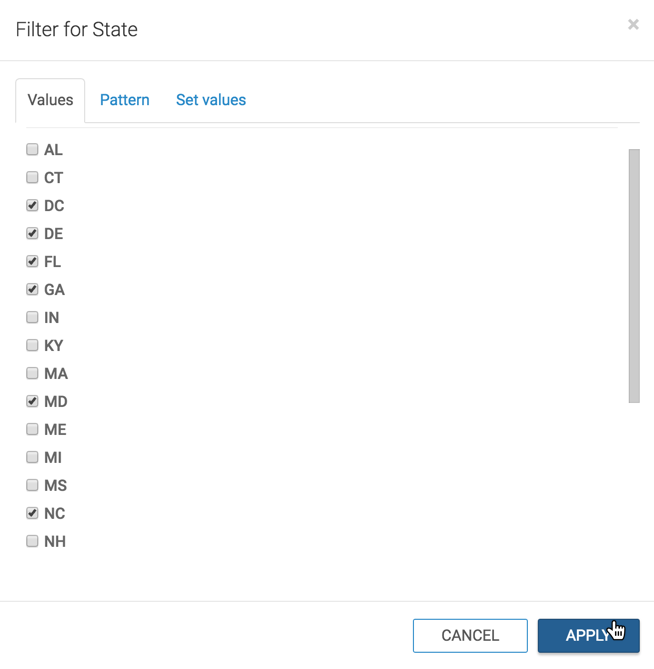
- Adjust the size range of the marks to 1-3, as described in Changing the Mark Size Range.
- [Optional] Change the color palette or simple reverse it, as described in Change Color Palette and Reverse Color Palette.
- [Optional] Enable panning and zooming option, as described in Customizing Zoom.
Click Refresh Visual.
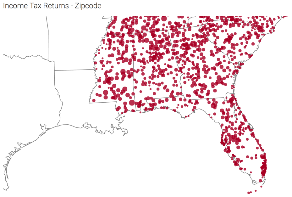
The map visual appears. You can adjust the size and focus of the visual to show the area of interest.
-
Click (pencil icon) next to the title of the visualization to edit it, and enter the new name.
- Change the title to
Income Tax Returns - Zipcode. At the top left corner of the Visual Designer, click Save.