Enabling the Trellis Option
Trellis charts are grouped sets of visuals that represent different partitions (segments) of the dataset in the same chart type, scale, and axes. This makes the comparison of sub-groups very intuitive. Trellis charts are sometimes called lattice charts, grid charts, panel charts, or small multiples.
- Any chart type that uses the X and Y axes explicitly may be trellisable, depending on the dataset. What is required is an extra entry on either the X or Y shelf; the first field on the shelf represents the segment definition of the trellis, and the second field is the actual dimension.
- Some charts types have optional X and Y shelves so that trellises may be enabled.
- Some datasets may be double trellisable — you could declare a 'partition' on both X and Y shelves at the same time.
You can find thorough examples of creating trellised charts in the following articles:
Trellis Example for World Life Expectancy Dataset
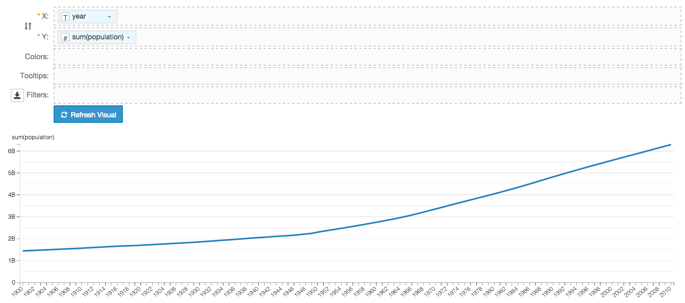
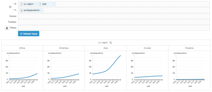
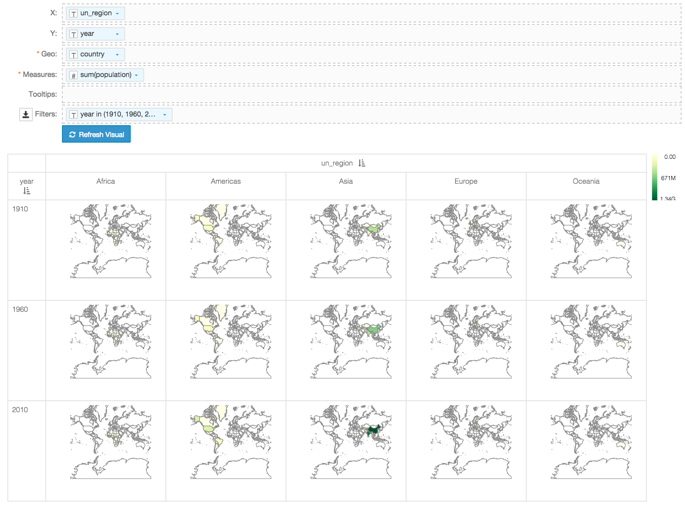
In this example in the World Life Expectancy dataset, the field un_region
can be a trellising partition. Placed on the X shelf along with
the year field, it creates a trellised version of a simple line
chart.
Similarly, you can make a trellis for many of the charts where the X and Y shelves are optional, by placing the field that represents the partition on an otherwise empty shelf. In the following visual, the mandatory shelves are Geo and Measures. Adding un_region to the X shelf creates a trellis.
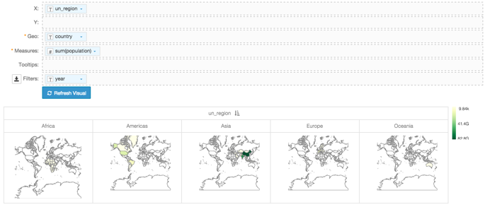
You can take it one step further, and define a secondary trellis for select years on the Y shelf. Note that we used the year field both on the Y shelf and on the Filters shelf, selecting years 1910, 1960, and 2010 to demonstrate the comparable populations across continents and across years.
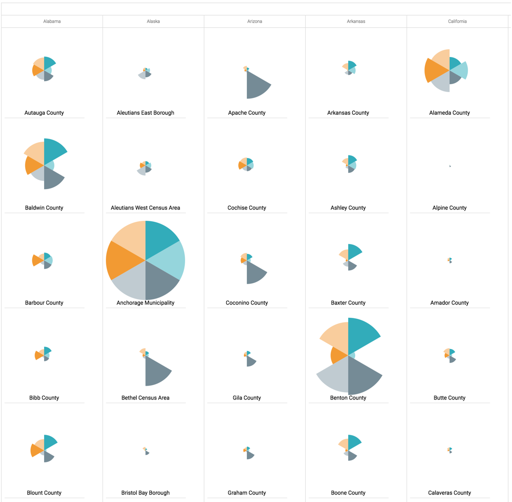
Trellis Example for US County Population Dataset
In this example in the US County Population dataset, we are using the field
stname (aliased as State) as a trellising
partition. Placed on the X shelf , it creates a trellised version
of a radial visual we developed in Radial Visuals.
This is the shelves set-up for the trellised visual:
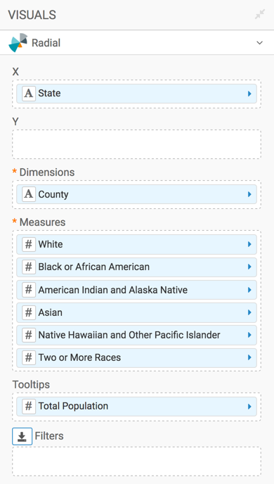
Notice that trellising organizes the individual radial charts into columns, by State. Within each column, the charts appear by alphabetical name of the County.