Chord Visuals
Chord visuals expose the inter-relationships between entities, making them an ideal choice for comparing the similarities within a dataset, or between different groups of data. The nodes/dimensions are on the circumference of a circle, and the relationships between them are the arcs inside the circle. The size of the node is proportional to the measurement. Arcadia Data uses color to help distinguish the overlapping relationship arcs.
Chord visuals are similar to Correlation Heatmap Visuals because they both compare exactly two dimensions. Chords, however, plot dimensions that cover the same value domain, and are better at pointing out the presence of a relationship between nodes than the relative magnitude of that relationship.
The following steps demonstrate how to create a new chord visual on a dataset SF
Cabrides. This dataset is based on data previously imported into Arcadia from the datafile
sf-cabride-distribution.csv. Note that each distinct
line segment between two dimensions reports the correlation data. Because the values for
pick-up and drop-off areas, srcarea and tgtarea , are in the
same domain, it makes the dataset ideal for demonstrating chord visuals.
- Start a new visual based on dataset SF Cabrides; see Creating Visuals.
-
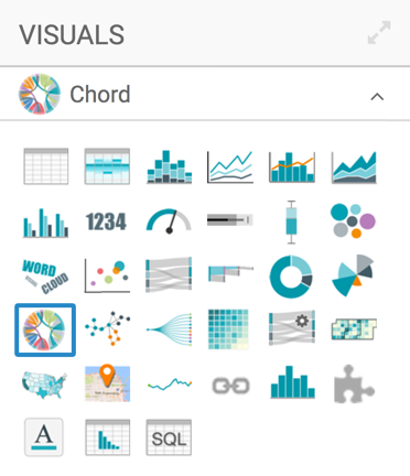
In the visuals menu, find and click Chord (row 4, column 1).
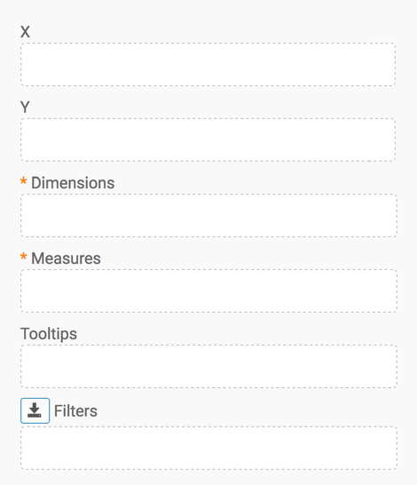
Note that the shelves of the visual changed.
They are now X, Y, Dimensions, Measures, Tooltips, and Filters.
Both Dimensions and Measures are mandatory.
-
Populate the shelves from the available fields:
- From Fields Dimensions, select
srcareaandtrgarea, and drag them onto the Dimension shelf on the main part of the screen. - Similarly, from Fields Measures,
select
ridesand place it onto the Measures shelf .
- From Fields Dimensions, select
-
Click Refresh Visual.
The chord visual appears.
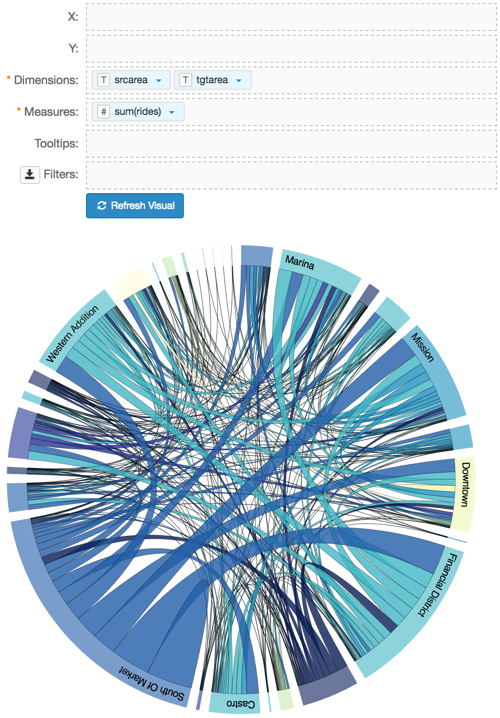
Chord Visual -
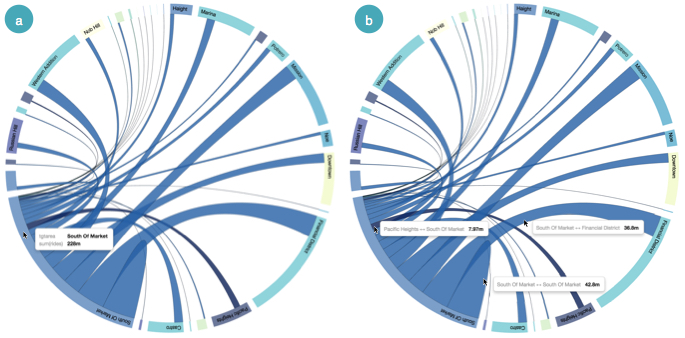
It is very easy to see the details of the individual dimensions:
- Hover the pointer over one of the nodes; the visual shows the connections that originate or terminate with this specific value, as well as the tooltip. In the following image, note all connections for 'South of Market'.
- Hover the pointer over one of the connections; the tooltip shows the detail for that connection: starting and ending notes, and the measurement.
Viewing Details of a Chord Visual - Click Edit next to the title of the
visualization, and change the title to
San Francisco Cab Rides -
        Chord
. At the top left corner of the Visual Designer, click Save.