Correlation Heatmap Visuals
A correlation heatmap uses colored cells, typically in a monochromatic scale, to show a 2D correlation matrix (table) between two discrete dimensions or event types. The values of the first dimensions appear as rows of the table, while the values of the second dimension are represented by the columns of the table. The color value of the cells is proportional to the number of measurements that match the dimensional values. This enables you to quickly identify incidence patterns, and to recognize anomalies.
Correlation Heatmap visuals are similar to Chord Visuals because they both compare exactly two dimensions. Correlation heatmaps are ideal for comparing the measurement for each pair of dimension values.
The following steps demonstrate how to create a new correlation visual on a dataset SFPD
Incidents, based on data previously imported into Arcadia from the datafile sfpd_incidents.csv. [data source
default.sfpd_incidents].
- Start a new visual based on dataset
SFPD Incidents[data sourcedefault.sfpd_incidents_2015]; see Creating Visuals. -
In the visuals menu, find and click Correlation Heatmap (row 4, column 4).
Note that the shelves of the visual changed.
They are now X, Y, Dimensions, Measures, Tooltips, and Filters.
Both Dimensions and Measures are mandatory.
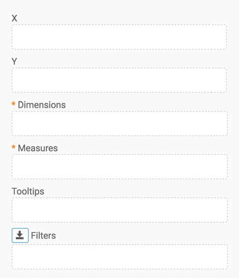
To show specific items, populate the shelves from the available fields (Dimensions, Measures, and so on) in the Data menu.
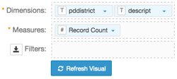
- Under Dimensions, select
pddistrictand drag it over Dimensions shelf on the main part of the screen. Drop to add it to the shelf. - Under Dimensions, select
descriptand drag it over Dimensions shelf on the main part of the screen. Drop to add it to the shelf. Under Measures, select
Record Countand drag it over Measures shelf on the main part of the screen. Drop to add it to the shelf.Note that
Record Countis defined by Arcadia Data as asumof events; if you hover over it with your mouse, you can see a black detail bubble withsum(1)contents.
- Under Dimensions, select
- Click Refresh Visual.
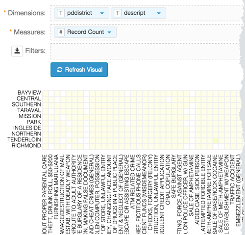
The default correlation heatmap visual appears.
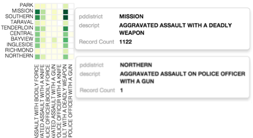
Note that this dataset has a very large number of possible values that represent the columns of the table. If you scroll to the right, you will see some cells rendered in dark shades of green.
To examine a shorter list of categories, let's add some filtering to the visual.
Under Dimensions, select
datetimeand drop it on the Filters shelf on the main part of the screen. Repeat withcategory, anddescript.On the Filters shelf, click (down arrow) on the
descriptfield, then click Pick values from a list.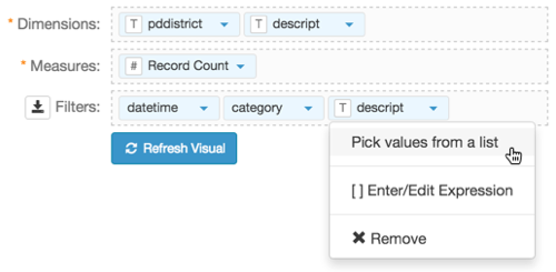
Select a number of values.
Here, we picked 7 distinct options.
- Click Refresh Visual.
Note that this smaller matrix also shows the entire range of color values.
- Change the title to
SFPD Incidents - Correlation Heat Map. At the top left corner of the Visual Designer, click Save.