US County Map, Choropleth
A county map of the United States shows a comparison of measurement values across US States.
The following steps extend the work completed in State Map, Choropleth, and demonstrate how to create a map visual on the dataset US County Populations [data source samples.us_counties]. It produces colored regions for the measurements that correspond to the county field.
county. This article demonstrates how to use the Alias setting to make the
dataset field ctyname conform to this requirement.- Clone the
US State Population - Choropleth Mapvisual. The clone opens in Edit mode. Under Dimensions, select
Click on the field to open the Field Properties menu, expand the Change Type option, and select the Geo Type County.ctynameand drag it over the Geo shelf on the main part of the screen. Drop to add it to the shelf, below theStatefield.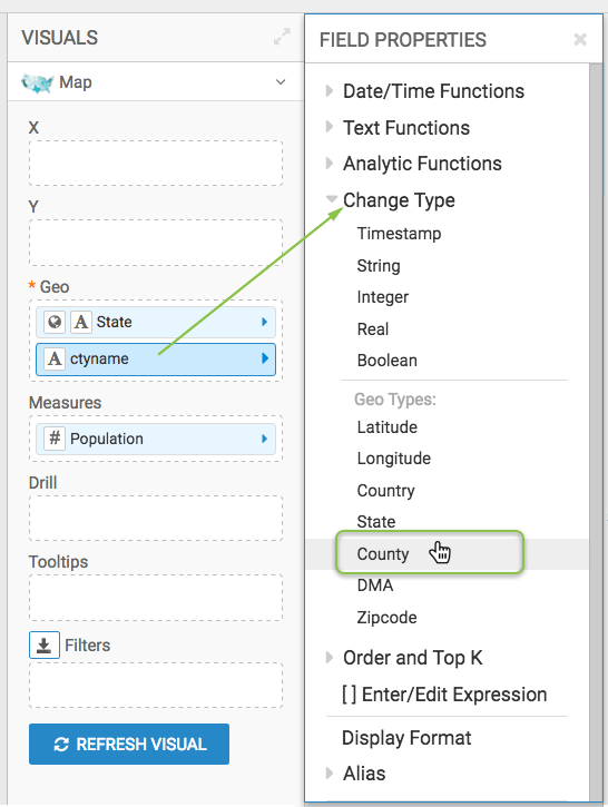
-
Alias the field
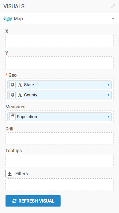
ctynameasCounty; see Alias. The shelves of the visual should look like this:
-
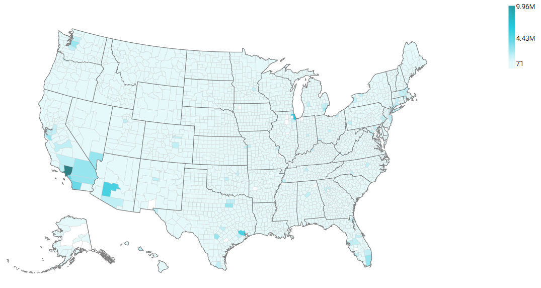
Click Refresh Visual.
The map visual appears.
- If not already selected, select the Enable pan and Zoom and Zoom to active area options, as described in Customizing Zoom.
-
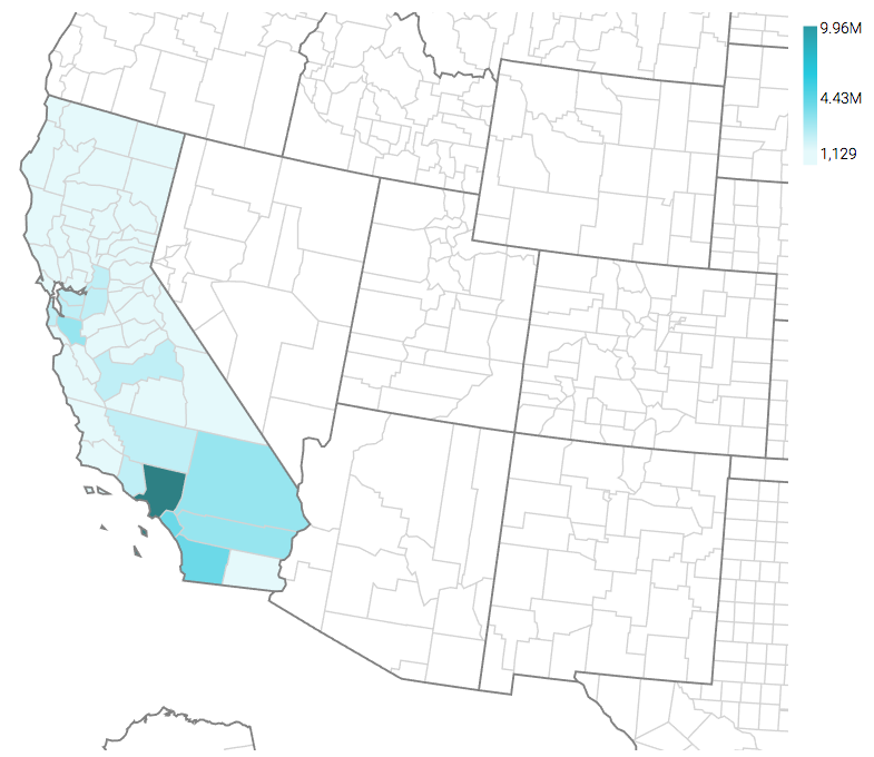
[Optional] Under Dimensions, select
stnameand add it to the Filters shelf. When the Filter for stname window modal appears, select California in the Values tab, and click Apply. Again, click Refresh Visual.
Note that the map automatically zooms in to show detail of California.
-
Click (pencil icon) next to the title of the visualization to edit it, and enter the new name.
- Change the title to
US County Population - Choropleth Map. At the top left corner of the Visual Designer, click Save.