Table Visuals
By default, a new table visual in Arcadia Enterprise displays all the fields of the underlying dataset. A table may be sorted along any measure or dimension, and its cells may be formatted using format strings.
The following steps demonstrate how to create a new table visual representation on a dataset
World Life Expectancy [data source
samples.world_life_expectancy].
- Start a new visual based on dataset
World Life Expectancy[data sourcesamples.world_life_expectancy]; see Creating Visuals. -
Note that by default, the table shows all fields in the dataset.
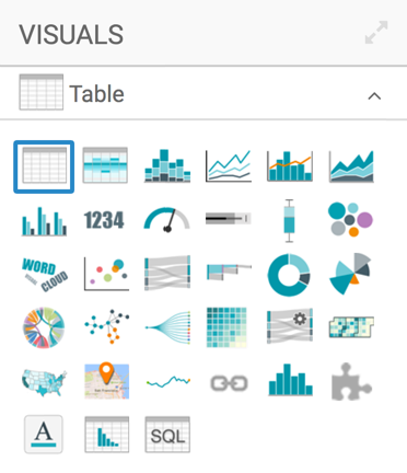
If your starting point is another visual type, then in the visuals menu find and click Table (row 1, column 1).
-
The shelves of the table visual are Dimensions, Measures, Filters, and Limit.
There are no mandatory shelves; if nothing is specified on the shelves, all the columns appear in the visual.
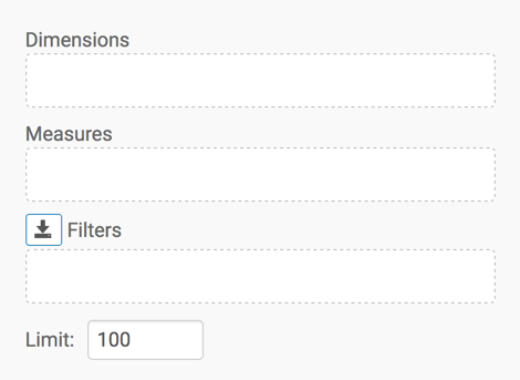
To show only specific items, populate the shelves from the available fields (Dimensions, Measures, and so on) in the Data menu.
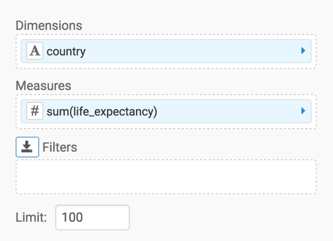
- Under Dimensions, select
countryand drag it over Dimensions shelf on the main part of the screen. Drop to add it to the shelf. - Under Measures, select
life_expectancyand drag it over Dimensions shelf on the main part of the screen. Drop to add it to the shelf.
- Under Dimensions, select
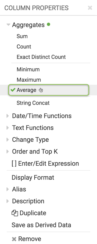
Change the aggregate of the
life_expectancyfield fromsum(life_expectancy)toavg(life_expectancy):-
On the shelf of the visual, click the icon to the right of the field.
-
In the Column Properties menu, click the icon next to Aggregates.
-
From the list of aggregate functions, select Average.
-
Click icon at the top of the Column Properties menu to close it.
-
Note that the shelf now contains the modified field with
avg()aggregation function.
-
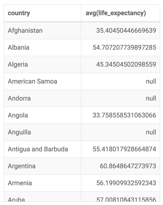
Click Refresh Visual.
The default table visual appears.
Alias the
countryfield asCountry, and thelife_expectancyfield asLife Expectancy:-
On the shelf of the visual, click the icon to the right of the field.
-
In the Field Properties menu, click the icon next to Alias.
-
In the text box below Alias, enter the alias name of column, as it should appear in the visual.
-
Click icon at the top of the Field Properties menu to close it.
-
Note that the shelf now shows the column with its alias name.
-
On the Filters shelf, add several Dimensions and Measures from the Data menu.
This enables you to dynamically control the data input, and discover the data at a more granular level.
For example, from Dimensions, drag
un_regionandyearfields onto the Filters shelf.Set
un_regionto Americas; it should appear asun_region in ('Americas')on the Filters shelf.Set
yearto 2001 through 2010; it should appear asyear in (2001,2002,…,2010)on the Filters shelf.[Optional] Change the value on the Limit shelf to another number, such as
12.Change the title to
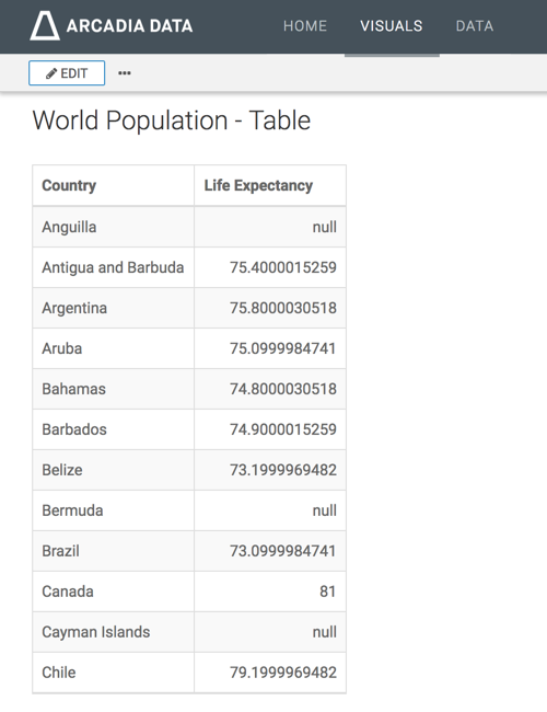
World Population - Table.-
Click (pencil icon) next to the title of the visualization to edit it, and enter the new name.
[Optional] Click (pencil icon) below the title of the visualization to add a brief description of the visual.
-
At the top left corner of the Visual Designer, click Save.
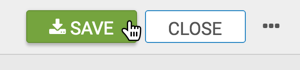
At the top left corner of the Visual Designer, click Close.
Your visual should look something like this: