Pie Visuals
Pie charts are circular statistical graphics that show numerical proportion through relative size of slices; the arc length of each slice is proportional to the quantity it represents. In Arcadia Enterprise, pie charts use a default 'doughnut' representation. However, you can change them to the more traditional closed pie configuration by controlling the arc width of the circle, as described in Arc Width.
The following steps demonstrate how to create a new pie visual representation on dataset
Capital Expenditure by Industry. You must first create this dataset, using
the steps described in Creating Datasets, from the datafile annual-capital-expenditure-industry.csv.
- Start a new visual based on dataset Capital
Expenditure by Industry. See Creating Visuals. -
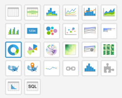
In the visuals menu, find and click pie (row 3, column 1).
-
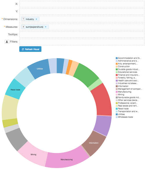
Note that the shelves of the visual include X, Y, Dimensions, Measures, Tooltips, and Filters.
The mandatory shelves for pie visuals are Dimensions and Measures.
Populate the shelves from the available fields (Dimensions, Measures, and so on) listed in the left navigation menu.
- Under Dimensions, select
industryand drag it over Dimensions shelf on the main part of the screen. Drop to add it to the shelf. - Under Measures, select
expenditureand drag it over Measures shelf on the main part of the screen. Drop to add it to the shelf.
- Under Dimensions, select
Click Refresh Visual.
The pie visual appears.
Click Edit next to the title of the visualization.
- Change the title to
Capital Expenditures - Pie. Above the left navigation bar, click Save.
[Optional] The default arc width is 80.
Adjust the arc width to close the hole in the middle of the 'doughnut': from the visual Settings menu, select the Marks tab, and set Arc Width to
0.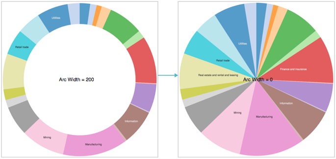
Closing the Hole; Changing Arc Width from 80 to 0 You can also experiment with changing the thickness of the 'doughnut'. The following image
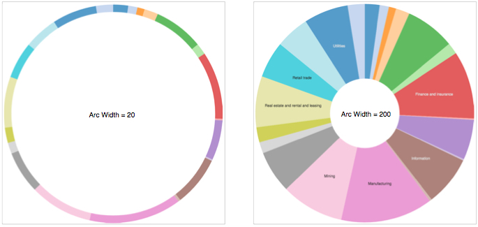
Contrasting Arc Widths: 20 and 200 See Arc Width for details on how to adjust the thickness of the 'doughnut'.
-
[Optional] You can adjust the default percentage reporting inside the Tooltip: from the visual Settings menu, select the Tooltip tab, and then change the Label for Percentage to Percent of Total and the Decimals included in percentage to
3.
Changing Tooltip Percentage Reporting Options To remove the default percentage reporting, unselect the default Include percentage of total in tooltip.
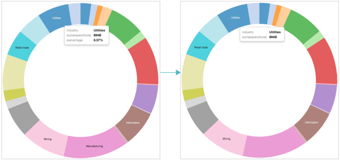
Removing Percentage Reporting from Tooltip See Customizing Tooltip.